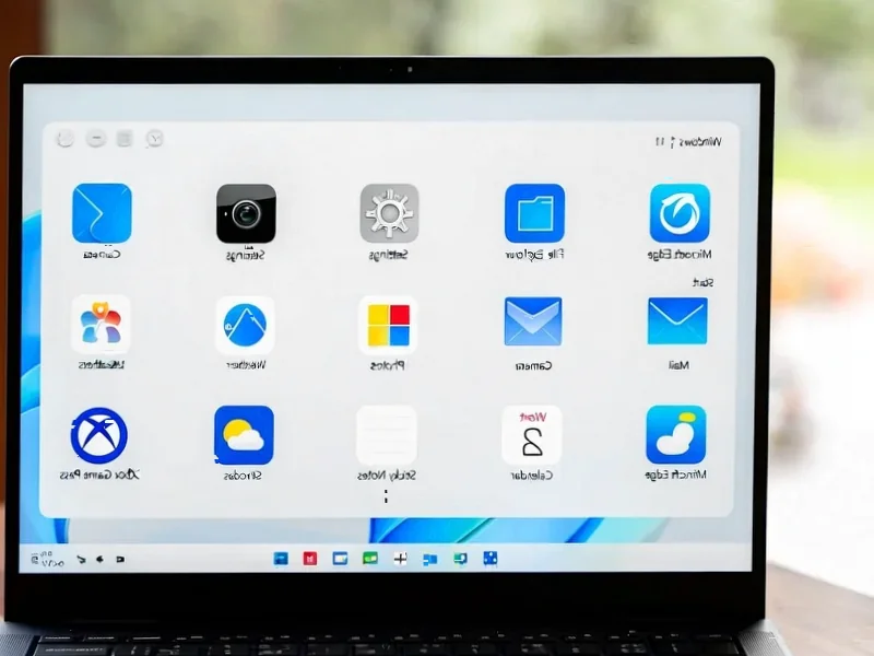
According to Windows Report | Error-free Tech Life, Microsoft just released Windows 11 Insider Preview Build 27982 to Canary Channel users, and it’s packed with significant interface changes. The familiar “Weather and more” lock screen panel is being replaced by interactive widgets that users can add, remove, and rearrange. Users can customize this through Settings > Personalization > Lock screen, with Microsoft promising more suggested widgets will automatically appear. The widget system itself gets multiple dashboards for organization and a new left-hand navigation bar for easier switching. File sharing also gets smarter with a new drag tray that appears when dragging files, showing shortcuts to compatible apps and the full Windows Share menu.

Microsoft’s Personalization Push
Here’s the thing about this update – it’s all about making Windows feel less like a static operating system and more like something that adapts to you. The lock screen widgets are particularly interesting because that’s prime real estate that’s been underutilized for years. Think about it – how many times do you actually look at your lock screen each day? Now Microsoft wants to fill it with sports scores, weather updates, and whatever else you might find useful.
And the multi-dashboard widgets? That’s Microsoft finally admitting that the current widget system was getting cluttered. Remember when they first introduced widgets and it was just this single, messy feed? Now they’re giving users actual organization tools, which suggests they’re serious about making widgets a core part of the Windows experience rather than just a novelty.
Smarter File Sharing
The drag tray for file sharing might seem like a small tweak, but it’s actually pretty clever. Instead of right-clicking and navigating through menus, you just start dragging and immediately get options. It’s one of those quality-of-life improvements that makes you wonder why it wasn’t there from the beginning. Basically, Microsoft is learning from mobile interfaces where sharing is often more intuitive.
But here’s my question – will these features actually make it to the stable release? The Canary Channel is where Microsoft tests their wildest ideas, and sometimes features get scrapped or significantly changed. Still, the fact that they’re investing this much in personalization and workflow improvements tells you where their priorities lie.
What’s really interesting is the timing. Microsoft seems to be doubling down on Windows 11 features even as people speculate about Windows 12. Maybe they’re planning to roll these improvements into the next major version, or perhaps they’re committed to making Windows 11 the best it can be regardless of what comes next. Either way, it’s good to see active development on the user experience front.


I don’t think the title of your article matches the content lol. Just kidding, mainly because I had some doubts after reading the article.